Dithered
There’s a munch of computing anachronisms that I still find charming that at the time we considered terrible. I guess in part its nostalgia, and in part I think it’s the realization that simplicity has its place: the quest for better things is necessary, but the stages along the way aren’t all inherently bad - they just felt that way at the time as it stopped you doing better things.
One of these things is how old Apple Macintosh computers dithered images to display them on their 1-bit colour depth displays. Whilst it’s great we have amazing colour displays today, I do find there is a nice artistic simplicity that old look has for certain images, particularly those with high contrast, like this picture of Tate Modern I posted yesterday:
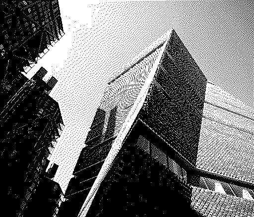
In abstract it’s a terrible rendition of the image, but for high contrast black and white images it’s a nice way to reduce them to their primitive elements without losing all the detail if you just set the sliders to the extremes of black and white in Lightroom.
Or perhaps, as I alluded to already, I’m just overly nostalgic 🤷♀️
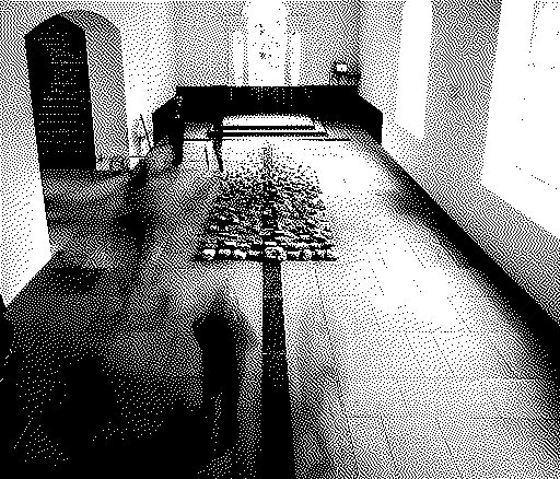
Here’s today’s photo upload, which also happens to be a highish contrast black and white piece:
I was all set to try reproduce this effect in photoshop, but when I went to research this I discovered this web page that implements the Hyperdither algorithm and you can just drop an image in there and bam, it’s like being back in the early 90s all over again.
- Next: Lightening the load
- Previous: Modern Color
- Tags: Photography, Retro