Quality graph
Ever wondered what the breakdown of Quality Street is in a tin? Laura made this graph to show exactly that:
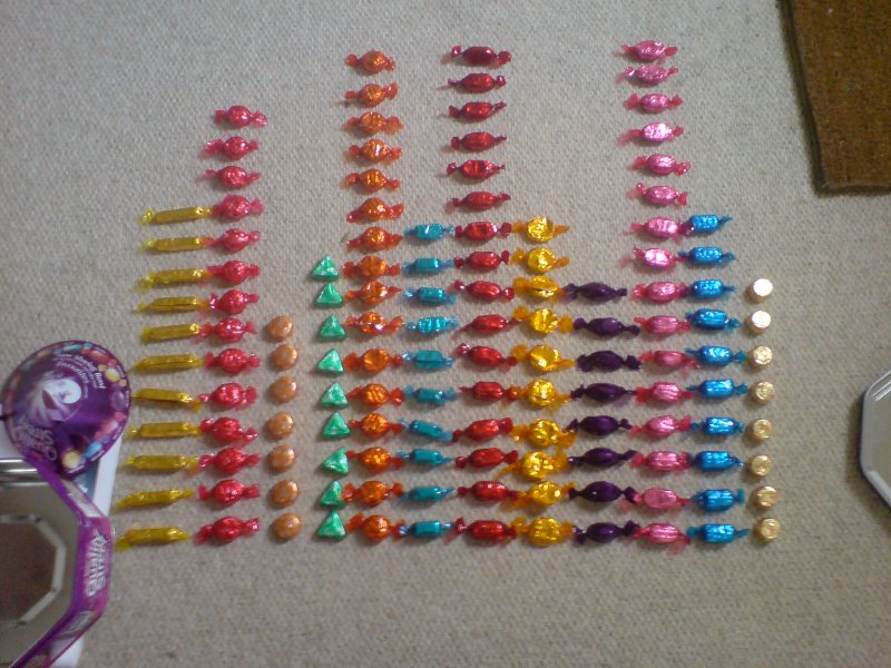
From this we deduce that foil covered sweeties are more expensive. Or something :)
- Next: New Ducati 1098
- Previous: Shoot to fill
- Tags: Data Driven Sweeties, Food, Histogram