Moving to Windows Phone
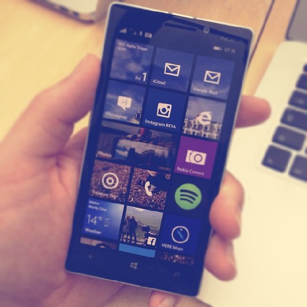
A couple of months ago I surprised both myself and quite a few of my friends by moving from iOS to Windows Phone running on a Nokia Lumia 930 for my daily device, and thought I’d write up some of my thoughts on it here.

Why change? Having consistently used iOS since the iPhone 3G (the oddly named second version of the iPhone), I decided it was time to try something different when I came around to replacing my iPhone 5. I’d held out until WWDC (Apple’s annual developer conference) to see what the next version of iOS held in store, but nothing from a user’s perspective seemed that new (at least for my typical usage). Don’t get me wrong, iOS is really good, and for the most part it just works, which as a user is fantastic, but as a technologist is a little bit dull. And it’s not just the phone OS that has stagnated, so have the applications I run on it. I’ve no idea if it’s me or the app store (or both), but I’ve found myself using the same ten or so apps for the last year, with nothing new to excite me about using my phone.
As an alternative I decided to go for something totally unknown – Windows Phone 8.1. I’d heard some good things about it, but had next to no experience of it (or indeed of Windows since I stopped working at Intel some eight years ago), so it seemed like a suitable technological adventure. And given that part of my aim was to compare it to my iPhone, I opted to buy the flagship Windows Phone phone at the time, the Lumia 930 (which, despite being their flagship phone, was actually cheaper than the equivalent iPhone, though still not cheap).
I’ve now lived with the phone for two months, and people keep asking my opinion on it, so here’s some thoughts on it to date: the good, the mixed, and the bad.
The good
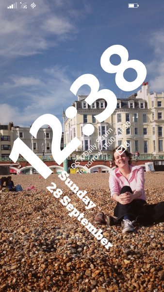
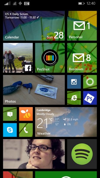
Windows Phone generally seems quiet slick UI wise. It suffers from animation overdose a little (as does iOS these days) slowing down navigation a bit, but on the whole, I do like the start of day experience with the phone. I’ve been using the Live Lock Screen Beta app to have a nicely playful lock screen, and the live tiles on the home screen actually have grown on me quite a bit. Some of the tiles are a bit annoying, and thus I’m forced to minimise them to shut them up (e.g., Cortana wants to show news headlines which I’m not interested in). But having the weather, calendar, and so forth on the home screen is quite nice. It would be nice to be able to have some apps have big tiles and no animations, but overall I do like the live tiles, which I didn’t think I would.


There’s some lovely bits of joined up thinking in Windows Phone overall. I’m signed into Facebook on my phone, and it uses people’s profile pictures from Facebook for my address book, saving me from having no pictures for most people. I have Laura’s contact page as a tile on my phone screen, and it’ll display not just Laura’s profile picture, but show what she said today on Facebook too. It was just seamlessly pulled together, which is nice.
The build quality of the Lumia itself is great, and the screen size (4.7”) was a big hit with me instantly (this was before anyone knew that Apple would go this way with the iPhone 6). Even after a couple of days, going back to the iPhone 5 to fetch odd bits of data, I realised that I’d struggle to go back to a small screen size. The other bit of the hardware I like is the wireless charging. At the same time I got the phone I got a Wireless Charging Pillow, which is a bit gratuitous, but it’s a lovely convenience not having to fiddle with cables just to recharge it over night; when I go to bed, so does the Lumia.
The mixed
The obvious thing that puts people off moving to Windows Phone is that, given its overall lack of popularity, the low number of apps in the app store when compared to iOS and Android. However, I did my homework before I jumped, and knew that most the apps I used daily were on Windows Phone. Social media is well covered, with things like Instagram, FourSquare/Swarm, Facebook, Twitter all there. So is Spotify, which is how I listen to most my music these days. Runkeeper, which I used to track cycling on iOS, was not there, but the competing Runtastic service is, and I could easily migrate my data, so I did.
One of the things I used on my iPhone regularly was a wide range of photography applications. I don’t have the bandwidth currently to spend hours with my DSLR, Aperture, and Photoshop, so instead on the iPhone had built up an array of apps I used to try make my Instagram output unique. On Windows Phone there’s certainly less to chose from, but it’s not totally bereft of photo applications. At the moment I’m mostly relying on Photoshop Express, which is a solid basic editing tool, but I do miss apps for more advanced editing and modification. Still, was able to take, edit, and publish this photo on my phone, so it’s not too bad:

There’s only been one app where I’ve found no equivalent, and that’s an RSS reader that’ll work with my chosen RSS service, Feedbin. There’s quite a few that work with the more popular Feedly, but for now I’m using the built in browser to access Feedbin, but that’s not nearly as nice on a mobile device as Reeder on iOS.
The camera is another big draw to picking the Nokia device, as they’ve always had a very good reputation, and as I say, I use my mobile device as my primary camera these days. Unfortunately, here the iPhone does beat it. Although on paper the Nokia camera may be better, its just not as usable as the iPhone’s camera for everyday usage. The Nokia camera is slower to focus, and slower to start, so the iPhone is much better for that capturing a moment instantly use case. On the flip side you do tend to get a lot more detail with the Nokia camera, but the iPhone is good enough on that for the majority of people. The Nokia camera is far from bad, and I’ve take some pictures I’m really pleased with, but the iPhone camera is just much more usable overall.
The bad
My main gripe with Windows Phone to date is the email client. Out of the box it assumes that we’re living in 1998, and thus tries to use the network as little as possible, only caching the last seven days of email, and not downloading images. In 2014 this is not what I’d expect as the default on the top of the line smartphone. But even with those options set to something more sensible, the client is just a bit more rough that its iPhone equivalent. Apple have made it very easy to flick through your email at speed: reading this, deleting that, and so on. Getting through my email on Windows Phone is just much slower. To delete a single email requires a mode change, a select, and a confirm, with my fingers moving up and down the screen. on the iPhone it’s a simple swipe and tap in a single location. My hope is Maestro, which goes into Beta next week, will provide a nicer alternative.
With the app ecosystem it’s a similar complaint: it’s not the lack of apps that’s the problem, but the lack of quality in the apps that are there. Even some of the apps from famous names that have lovely iOS apps, their Windows Phone apps just feel like they just left it to the intern to knock up over the weekend. I’m hugely grateful that there’s anything from 1password on Windows Phone at all, but boy does their Windows Phone app aspire to be done by an intern. The only exception to this rule is the first party apps. For example, the Xbox Smart Glass app on Windows Phone is absolutely wonderful to use – and shows you that you can write awesome Windows Phone apps that will stand proud alongside apps on iOS in terms of features, ease of use, and aesthetics; it just seems other people aren’t willing to put in the effort.
A small thing: there’s no timer app built in, which to me is insane, and reduces the functionality of Cortana when compared to Siri by half (i.e., half the time I used Siri was to set a timer when cooking :).
Finally, there’s a few UI bits that just don’t sit right with me. Windows Phone phones have three hardware buttons below the screen, back, home, and search, and the functionality of the back button is context sensitive, thus at times confusing. Let’s use the mail application as an example. In normal use I’ll launch the mail app, see my inbox, and then drill down to a specific email, and press back to return to my inbox. That to me makes sense, and I’m happy. However, if I pick up my phone, see I have 8 mail notifications, and select the first email to read, back takes me to whatever I was doing before I looked at that notification, not as I anticipate to my inbox so I can see the other emails waiting for me.
Although the back button is simple to describe as a rule (takes you to the last screen you saw across all applications), because what it does is context sensitive it works against my muscle memory for how to navigate through applications. There is no alternative either: once in a mail via notification, I just simply can’t get to my other email without going out of mail and coming back in. I can see a certain design rational for this, but in practice it just is annoying, and now if I have mail notifications I tend to go and find the application to read them rather than clicking on the notification.
Summary
Overall, if you just want a phone that works all the time, I’m afraid I’d still recommend an iPhone over a Windows Phone; but I do enjoy using Windows Phone and am in no rush to give it up. As technologists it’s part of our job to understand all the alternatives, and this is a nice reminder of what life is like outside the iOS ecosystem (and I still have my iPad, which I’m in no rush to replace with a Surface :).
Window Phone is clearly still evolving as Microsoft try to up their game. Each update I get adds some great new bits and pieces to the underlying OS. I think the shame will be if Windows Phone never gets the app developers it deserves. I suspect there’s a small, but reasonable business out there for the first company that actually builds a suite of apps worthy of the platform underneath them.
- Next: The same old photo
- Previous: When the future arrives
- Tags: Geek, Mobile, Windows