Saying more with less in user interfaces
Getting network diagnostics right is a real pain. At Camvine we make a networked digital signage player that people should just be able to plug in to their network and a screen, go the website, register the box, and they’re done. Easy.
Except, in the real world it’s harder – computer networks are complicated things, so even though we’ve taken every effort to make sure the website and the player hardware are as easy to use as we can, the magic ingredient of having a network “just work” is not always what happens.
So the network is shonky, it’s not our fault, but we need to find a way to express this to the user – otherwise they just think our system is broken. Better still, we want to try and inform them of what’s wrong if we can figure that out – that way we reduce their time trying to fix their network so they can get on and achieve things using our product.
Whilst pondering how we should solve this (a fix due in an upcoming release of our CODApod player software), I came across this really neat solution from Microsoft on the XBox 360:
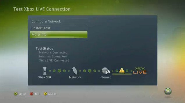
This is quite a simple view, most users will never see, but if they do need to work out their network issues it’ll tell them quickly at a glance where the problem is: is it plugged in to the router? can we talk to the Internet? are the Xbox Live servers up? It’s not rocket science, but compared to a lot of network diagnostic pages you see, this is sheer bliss in its simplicity.
Solving the underlying problem may then be harder (say, a router misconfiguration) but at least you’re directed to the solution quickly and without fuss in that simple diagram – a great achievement for a user interface.
- Next: Freedom to play off the rails
- Previous: Make your own CGI movie on the web
- Tags: Camvine, Geek, XBox