Contrasting spaces
Day 70 of 365.
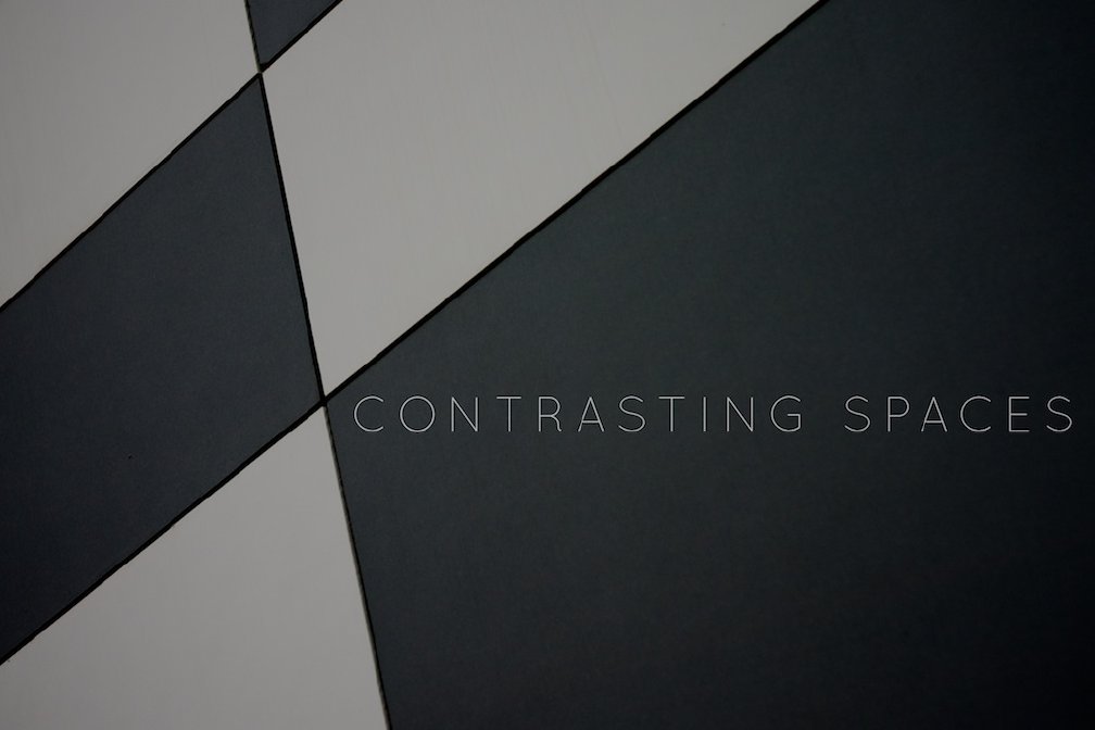
This is a photo of panels on a building, and the result probably is more pleasing to the eye than the original building. I liked the abstract nature of the end result.
The wording is probably a bit pointless, but finding space to place text is something I struggle with, so I wanted to abuse the design look of the photo to try out some lettering - you only learn by doing.